Why follow the “old rules” instead of improving the user experience and sell more?
Every business is changing, and the web industry is progressing faster than anything else. Rules of the games never remain the same – things that worked five years or even a year ago might not work anymore. Webmasters around the globe are testing different approaches, and today we’re going to talk about the ones that obviously don’t work.
What should you remove from your site? There are at least seven things that may annoy your customers, and we describe each of them below.
Please note that everything you can see below isn’t an absolute truth, but it works in at least 90 percent of cases, so why not take it into consideration?
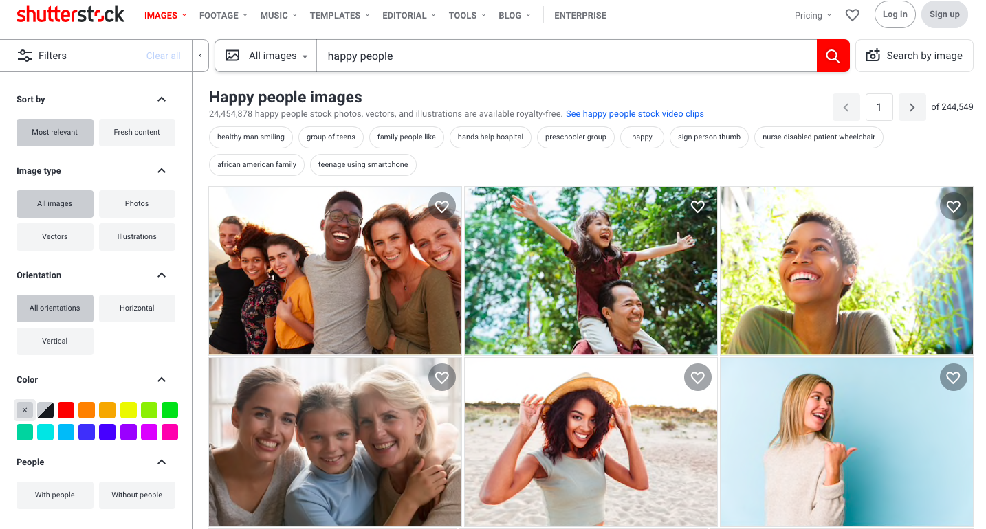
Stock photos, especially photos of people
Nielsen Norman Group did an interesting study where they confirmed what we all suspected – users hate and usually ignore stock images of people. Some may say that nothing is wrong with ignoring pics – after all, part of them is always ignored as purely decorative elements. However, if you are selling something on the web, gaining a customer’s trust is your top priority. Pictures of products and staff are what can increase the level of trust significantly.
Let’s be honest – stock photos of people in offices look completely unnatural, and site visitors understand this immediately.
Consequently, pictures aimed at making people trust you do exactly the opposite. If you don’t want to spend money on hiring a professional photographer, ask someone to take a photo or take a selfie – it would be much better than uploading a photo of a “perfect” and unnaturally happy blue-collar worker.
Vague, unclear headlines
The so-called vague words like “excellence,” “experience,” “dedication,” and so on in headlines are the “white noise” for a customer. They don’t really say anything about you, your company, your niche, etc. Simply put, such vague headers don’t perform their main and only function: they don’t tell visitors who you are and what you do, don’t inform them.
That is why we recommend removing the vague words telling them that you are the best in something and replacing them with a phrase that actually explains to customers what they can get from you and why they need it.
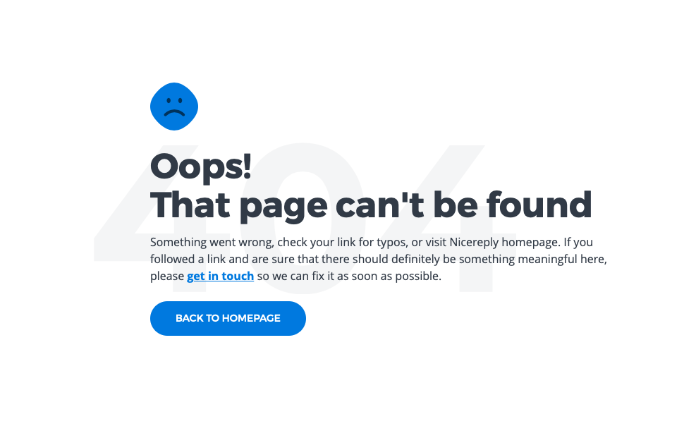
404 pages
You should remove all dead links and 404 pages from your website, and you should do it regularly. Yes, it is a well-known fact, but surprisingly, a lot of webmasters forget about it or ignore the importance of audit. This, of course, is the wrong approach because 404 pages frustrate the user and significantly worsen the UX.
The good news is you shouldn’t do it manually – there are plenty of quality SEO tools to audit the website. We usually use SE Ranking to test all pages and links on the site, find the broken and non-existent ones twice a month and remove them. By the way, using such platforms as SE Ranking is always a good idea because you can solve multiple problems simultaneously, for example, find missing meta tags, correct technical errors, check loading speed, scan images, etc.

Social media icons in headers
Social media icons are important because you should provide site visitors with an opportunity to share your post on popular social media websites. This may get you more traffic than you ever expected, but this can also distract users from the post itself. There is a chance that a user will stay on YouTube and forget about what they’ve just searched for.
So, what’s the solution? A reader can become a lead if you don’t put icons in your header – putting it in your footer is a much better option. Moreover, you shouldn’t use too vivid colors for your icons – making them grey or beige, or pink ( or any other not too visually prominent color, depending on your color scheme) is a good option.
Email links
Posting email addresses is an old habit, but the truth is we all should finally give up providing them on websites. Why? Because there is a better way to provide great customer support, answer the questions, tell more about the services and special offers than sharing your email address. We recommend using contact forms instead – that is how you can protect yourself from tons of spam that robots are sending to everyone who has ever posted the email address, avoid being measured in Google Analytics, and improve your marketing.

Creating a Contact Us page allows a user to reach you without leaving the site, allows you to provide extra useful content, answer the specific questions, group the questions and redirect them to the right departments, etc. After all, you will be able to contact users who are really interested in getting those emails from you without annoying ones who don’t actually need that.
Auto-play videos & music
Audios and videos are great – they make your content even more useful and illustrative. However, most users hate when websites are literally too loud, especially if they have dozens of tabs open. We bet you visited such websites, too – you are looking for some info and cannot figure out where that disturbingly loud sound comes from.
In most cases, users just close the site just because it is the simplest and the fastest way to turn off that sound, not to mention that they come to get the useful information and not to get scared to death. Simply put, if you don’t disable auto-play, you usually provide a horrible user experience. You can avoid it with a few clicks – just disable the auto-play feature, and you will make the most of useful videos and audio files.
Too long paragraphs, too much text
Everyone’s in a rush nowadays, and the only thing that users actually want is to find the info they need. They want to do it immediately, and it’s nearly impossible if they have to search for the right piece of content in a huge, poorly-structured text.
That is particularly relevant for eCommerce websites. If you are selling the product, you should provide the most useful information about it. Long, vague descriptions make visitors leave the site, and the short paragraphs, lists, and pics make them stay and buy.
Conclusion
Some may say that this is obvious, but if you visit a few random websites on the web, you are likely to see at least one of those things. Paradoxically, each of them is aimed at attracting customers, but they are actually annoying users. So why follow the “old rules” instead of improving the user experience and sell more?


